Tuesday, July 27, 2010
Tuesday, July 20, 2010
T6 Lesson 7Combining Images using Layer Masks fix cont.....
I have Fixed the spelling, Made Mirror alot bigger, changed the "more than" slogan to white and changed the colour.Also moved type up using the rule of the third. I am happy now......hope Chris is............Making the picture bigger really works .learning alot in this course!!
T6 Lesson 7Combining Images using Layer Masks fix
I Sort of got it right: Chris Wrote:In terms of design (for me) the "focus" of the layout is indistinct; it's dominated by the background gradient from bright white to electric blue. It overwhelms the window artwork which, in turn, competes with the copy for attention.
The "built to withstand the harshest reflection" phrase is nicely typeset and coloured and positioned...it falls naturally with the flow.
Easy fix might be to try a mild transition for the gradient from electric blue to darker electric blue.
I think this looks better. Thanks Chis
The "built to withstand the harshest reflection" phrase is nicely typeset and coloured and positioned...it falls naturally with the flow.
Easy fix might be to try a mild transition for the gradient from electric blue to darker electric blue.
I think this looks better. Thanks Chis
Monday, July 19, 2010
Sunday, July 18, 2010
T6 Lesson 3 Flatbed Scanner
This Is a party Scene!! : First has a few drinks, then meets girl, they have fun , he gets sick , hurts himself, then goes to hospital. Wow What a night!!
Wednesday, July 14, 2010
Tuesday, July 13, 2010
Monday, July 12, 2010
Sunday, July 11, 2010
Thursday, July 8, 2010
Lesson 13 Poster Design
This lesson is about changing fonts to help explain the quote.
Hopeful you found it hard to work out what it is saying
Lesson 12 Good & Bad Type BAD
Picking on someone design was hard, knowing how hard it is to design.but, boy it was fun !!
I used an example from our showroom here at Wyllie's, lets just say I'm still off the Xmas card list.. woops!
realising now what fonts to use.
lesson 11 Match 6 type faces to 6 shoes
In this lesson had to select the right type for the right shoe......Maybe the only thing I'll get right!! :o)
Lesson 10 Your Name in a typeface
This lesson on type face, Myraid Pro is great so many different ways to change the letters
have heard 2 out of ten sibrian yak hearders love this font!!
Lesson 9 Sketching layouts cont....... PAGE2
Learning that the humans look from the left top corner down to the bottom right, my plan of attack was to try and make the viewer to look at the logo then the picture, then the home, contact and specials buttons which are green, hopefully this way they will look at the whole page....Chris has advised me, that the black is dominating the page and the hero shot. and the buttons are all over the place.....so with some white space, order, grids, colour, unity some luck a bit of help and alot of thinking a wishing, I will pull it off, or my hair out.....I need a nap!
Lesson 8 cont......
I see grids everywhere now, before I just thought it was spacing or white space. I like grids, grids are my friends!!
Lesson 7 Hundred Apples PAGE1
Had to draw 100 apples 100 different ways...This really tested my drawing...but it was great to see all the ideas come out for future use..I liked Dickens Cider Apple Jucie!! and Batman Apple
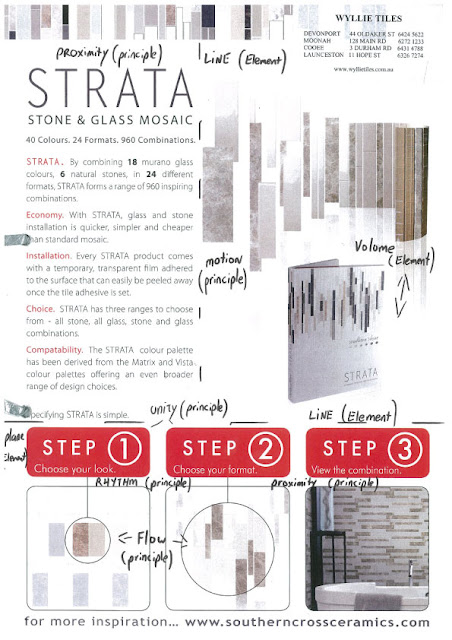
Lesson 3 Identifying Elements & Principles
Never did I realise so much must be understood, there is more than just laying it all out and not touching each other!
Subscribe to:
Comments (Atom)


 T
T


